
Minimalist design has become increasingly popular in recent years, captivating both designers and users alike. Known for its clean lines, simplicity, and focus on essential elements, minimalist design has the power to create visually striking and impactful experiences. While many may associate minimalist design with a limited color palette, colors actually play a crucial role in this style of design. In this article, we will explore the significance of color in minimalist design, common color choices, guidelines for using color effectively, and the benefits and drawbacks of minimalist color use. So, let’s dive in and discover how colors can bring life to minimalist design!
The Role of Colors in Minimalist Design
Minimalist design is a popular approach that emphasizes simplicity, clean lines, and a focus on essential elements. It has gained traction in various fields, from architecture and interior design to graphic design and web design. With its sleek and uncluttered aesthetic, minimalist design has become a favored style for those seeking a harmonious and calming environment.
Definition of Minimalist Design
At its core, minimalist design is about stripping away excess and embracing a “less is more” philosophy. It is marked by simplicity, a reduction in unnecessary ornamentation, and a deliberate use of negative space. It seeks to create a sense of harmony and balance by eliminating any elements that do not serve a clear purpose.
Key Principles of Minimalist Design
To truly embody the essence of minimalist design, there are a few key principles to keep in mind. These principles guide the decision-making process and ensure that the end result reflects the core tenets of minimalism:
- Simplicity: The foundation of minimalist design is simplicity. By eliminating unnecessary details, clutter, and distractions, the design becomes cleaner and more focused. This simplicity allows the essential elements to shine and creates a sense of calm.
- Empty Space: Negative space, also known as empty space or white space, is an essential component of minimalist design. It provides a visual break and a sense of breathing room for the eyes. Embracing empty space allows the design to feel more balanced and uncluttered.
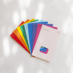
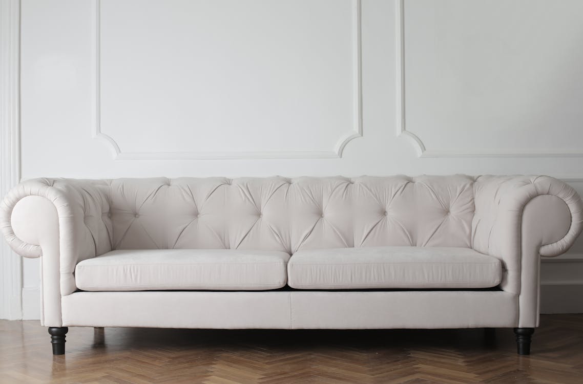
- Limited Color Palette: Minimalist design often relies on a limited color palette, usually consisting of neutral tones such as white, black, gray, and beige. By reducing the number of colors used, the design feels more cohesive and restrained. This restraint allows other elements, such as shapes and textures, to take center stage.
- Clear Typography: Typography plays a crucial role in minimalist design. Opt for clean, legible fonts that have a sleek and modern appeal. Maintain consistency in font choices and sizes to create visual unity throughout the design.
- Purposeful Hierarchy: In minimalist design, hierarchy is key. Establish a clear visual hierarchy by using size, color, and placement to guide the viewer’s attention. By prioritizing essential elements and organizing content in a logical manner, the design becomes more intuitive and user-friendly.
- Functionality: Minimalist design often prioritizes functionality over decoration. Every element within the design should serve a purpose and contribute to its overall function. This focus on functionality ensures that the design remains practical and efficient.
To truly understand and appreciate minimalist design, it’s important to delve deeper into its principles and explore real-life examples. By adhering to these principles and embracing the essence of minimalism, designers can create visually striking and harmonious designs that stand the test of time.
“Minimalism is not about removing things. It’s about removing distractions.” – Anonymous
The Significance of Color in Minimalist Design
Minimalist design is all about simplicity, clean lines, and a focus on functionality. But does that mean color has no place in this minimalist aesthetic? Absolutely not! Despite its emphasis on simplicity, color plays a crucial role in minimalist design, adding depth, meaning, and visual interest. In fact, the strategic use of color can make or break the success of a minimalist design.
Role of Color in Conveying a Message
In minimalist design, every element must serve a purpose, and color is no exception. It serves as a powerful tool to convey messages and evoke specific emotions. Here’s why color is significant in minimalist design:
- Brand Identity: Color is closely tied to brand identity, and minimalist designs often rely on a limited color palette to reinforce brand recognition. Think of iconic brands like Apple or Nike, which are instantly identifiable by their use of minimalist colors like white and black. These colors represent simplicity, elegance, and sophistication.
- Creating Focus: When used strategically, color can draw attention to key elements in a minimalist design. By incorporating a pop of color or utilizing contrasting shades, designers can guide the viewer’s gaze to important information or calls to action. This technique helps enhance user experience and make the design more effective.
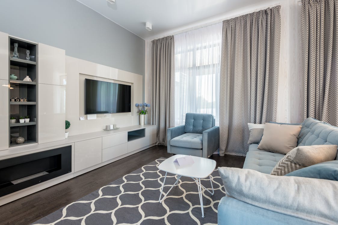
- Setting the Mood: Color has the power to evoke specific emotions and set the mood of a design. For example, warm colors like red and orange can create a sense of energy and excitement, while cool colors like blue and green evoke feelings of calmness and serenity. By carefully selecting colors that align with the intended mood or atmosphere, designers can enrich the user’s experience and reinforce the overall message of the design.
Impact of Color on Visual Perception
Color not only conveys messages and emotions but also has a significant impact on how we perceive and process visual information. Consider these factors:
- Contrast and Legibility: In minimalist design, where simplicity is key, it is essential to strike a balance between minimalism and legibility. Proper color selection and contrast can enhance readability and ensure that the content is easily accessible to the viewer. Choosing colors with enough contrast helps to ensure that text and important elements stand out and can be easily understood.
- Visual Hierarchy: Color can also aid in establishing a clear visual hierarchy within a design. By assigning different colors to different levels of importance, designers can guide the viewer’s attention and make the content more scannable and digestible. This technique is especially useful in minimalist designs, where there are fewer elements competing for attention.
Creating Contrast with Minimal Colors
One of the challenges of minimalist design is the limited color palette. However, this limitation can also be an advantage when it comes to creating contrast and visual impact. Here are some techniques designers employ to make the most out of minimal colors:
- Texture and Patterns: Instead of relying solely on a variety of colors, designers often introduce textures and patterns to add depth and interest to a minimalist design. By carefully selecting and combining textures and patterns, designers can create a visually stimulating composition without sacrificing the simplicity of the overall design.
- Negative Space: Negative space, also known as white space, is a fundamental principle of minimalist design. It refers to the empty areas around and between elements. By utilizing negative space effectively, designers can create a sense of balance and contrast, making the design visually appealing and allowing the chosen colors to stand out even more.
In conclusion, color plays a vital role in minimalist design, adding meaning, emotion, and visual interest. It is a powerful tool for conveying messages, guiding attention, and setting the mood. Despite the limited color palette, designers can use techniques such as texture, patterns, and negative space to create contrast and visual impact. So, don’t underestimate the significance of color when it comes to minimalist design—it’s not just about black and white, but the thoughtful and intentional use of color can elevate and enhance the overall design experience.
Also Read : Color Ideas to Try : Transform Your Kitchen with a Fresh Coat of Paint in 2023
Common Color Choices in Minimalist Design
When it comes to minimalist design, color choices play a crucial role in creating a clean and visually pleasing aesthetic. While minimalist design often leans towards simplicity and minimal use of color, there are still some common color choices that designers tend to gravitate towards. In this article, we will explore the prevalence of monochrome, the popularity of neutral colors, and the use of bold colors for emphasis in minimalist design.
Prevalence of Monochrome
One of the most widely used color schemes in minimalist design is monochrome. Monochrome refers to the use of varying shades and tones of a single color. This approach creates a sense of harmony and unity in the design, while still providing visual interest.
Monochrome color schemes are versatile and can work well in various design contexts, from websites and mobile apps to interior design and branding. Some popular monochromatic color choices in minimalist design include:
- Shades of gray: Gray is a timeless and neutral color that adds sophistication and elegance to any design.
- Soft pastels: Soft pastel colors like light pink, baby blue, and mint green create a calming and serene atmosphere in minimalist design.
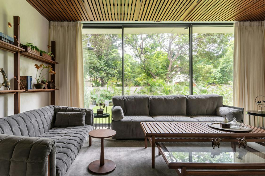
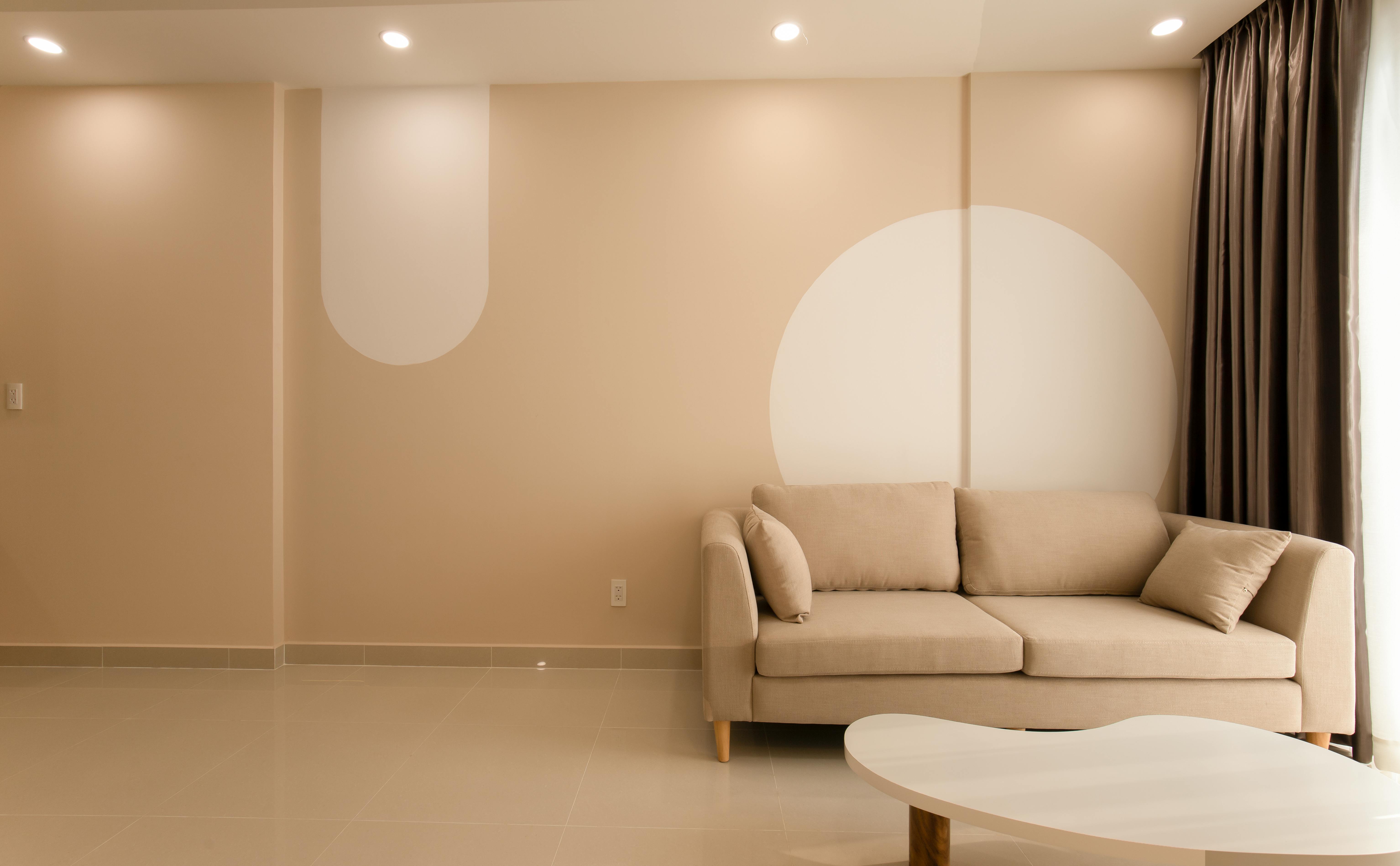
- Earth tones: Earthy colors such as beige, taupe, and olive green evoke a sense of nature and warmth.
Popularity of Neutral Colors
Neutral colors are another staple in minimalist design. These colors create a sense of balance, simplicity, and timelessness. Neutral color palettes are often used as a base in minimalist design, allowing other design elements to stand out without overwhelming the overall aesthetic.
Neutral colors are versatile and can be used on their own or paired with bolder accent colors. Some popular neutral color choices in minimalist design include:
- White: The epitome of simplicity and cleanliness, white is commonly used as a background color in minimalist design.
- Beige: Beige is a warm and inviting neutral color that adds a touch of warmth and elegance to minimalist interiors.
- Light gray: Light gray is a versatile neutral color that can create a sense of calm and sophistication in minimalist design.
Use of Bold Colors for Emphasis
While minimalist design often leans towards a muted and restrained color palette, the strategic use of bold colors can help create visual interest and draw attention to specific elements in the design.
Bold colors serve as focal points and can be used sparingly to create contrast and impact. Some popular bold color choices in minimalist design include:
- Primary colors: Colors like vibrant red, bold blue, and sunny yellow can add a playful and energetic touch to minimalist design.
- Jewel tones: Rich and saturated jewel tones like emerald green, sapphire blue, and amethyst purple can create a sense of luxury and opulence in minimalist interiors.
In conclusion, while minimalist design is known for its simplicity, the color choices still play a crucial role. Whether it’s the prevalence of monochrome, the popularity of neutral colors, or the strategic use of bold colors for emphasis, these common color choices in minimalist design contribute to creating visually stunning and harmonious aesthetics.
Guidelines for Using Color in Minimalist Design

In minimalist design, color plays a crucial role in conveying the intended message and creating a harmonious visual experience. Carefully selecting and using colors can elevate a minimalist design from plain and dull to engaging and impactful. In this section, we will explore some guidelines for effectively using color in minimalist design to create visually stunning and coherent designs.
Understanding Color Psychology
To make informed color choices, it is essential to understand the psychology behind colors and the emotions they evoke. Different colors can elicit various emotions and have distinct connotations. Here are a few common associations:
- Red: Passion, energy, and urgency
- Blue: Calmness, trust, and professionalism
- Yellow: Cheerfulness, joy, and optimism
- Green: Growth, health, and freshness
- Black: Elegance, power, and neutrality
- White: Simplicity, purity, and cleanliness
Understanding these associations can help designers select colors that align with the intended mood and message of the design. For example, if the design aims to evoke a sense of calmness and relaxation, incorporating shades of blue would be a wise choice.
Choosing an Appropriate Color Palette
When working with minimalist design, it is essential to limit the color palette to a few carefully selected colors. This helps maintain the simplicity and elegance characteristic of minimalism. Here are some tips for choosing an appropriate color palette:
- Stick to a limited number of colors: Using too many colors can make the design appear cluttered and overwhelming. Restricting the color palette to two or three colors ensures a clean and cohesive look.
- Contrast is key: Incorporating contrasting colors allows elements to visually pop and adds depth to the design. For example, pairing a dark color with a light one creates a striking contrast that draws attention to specific elements.
- Consider the background: Ensure that the chosen colors work well with the background. A well-chosen color palette should create a nice balance between the foreground and background elements.
Balancing Colors in a Design
Creating a visually pleasing minimalist design involves achieving a balanced distribution of colors. Here are some techniques to achieve color balance:
- Use color accents: Incorporating small pops of color strategically can add interest and draw attention to specific elements. Consider using color accents on buttons, links, or important headings.
- Apply color hierarchy: Assign different levels of importance to various elements in the design hierarchy. Use colors to differentiate and emphasize essential elements from less significant ones.
- Consider color proportions: Ensure that colors are used in appropriate proportions to maintain visual harmony. One color should not dominate the design excessively, as this may disrupt the overall balance.
By adhering to these guidelines, designers can create minimalist designs that effectively utilize color to engage and captivate viewers. Remember, less is more in minimalist design, and the thoughtful use of color can make all the difference in creating impactful designs.
Benefits and Drawbacks of Minimalist Color Use

Have you ever been captivated by a design that uses minimal colors? There’s something incredibly striking about a clean and minimalist aesthetic. Whether it’s a sleek website, a minimalist logo, or an eye-catching advertisement, minimalist color use can have a profound impact on the viewer. In this section, we will delve into the benefits and drawbacks of embracing this design approach. Let’s explore the advantages first.
Advantages of Using Minimal Colors
- Enhanced Focus: Minimalist color schemes remove distractions and help to direct the viewer’s attention to the most important elements. By limiting the color palette, designers can guide users to focus on specific areas and messages.
- Simplicity and Clarity: Minimal color use creates a sense of simplicity and clarity in a design. This approach allows for the effective communication of ideas and messages without overwhelming the viewer.
- Timelessness: Minimalist design has stood the test of time. By adhering to a minimal color palette, designers can create designs that stay relevant and fresh for years to come. A timeless design retains its appeal, even as design trends evolve.
- Versatility: Minimal color schemes offer great flexibility when it comes to adapting designs across various platforms and media. A minimal design can be easily applied to different mediums, such as websites, print materials, and social media posts, without losing its impact.
- Brand Recognition: When a brand consistently uses a minimal color palette, it becomes instantly recognizable. Think about brands like Apple, Nike, or Coca-Cola. Their iconic minimalistic designs have become synonymous with their brand identity, making them easily distinguishable in a crowded marketplace.
Now, let’s dive into the potential drawbacks of using minimal colors and explore strategies to mitigate them.
Potential Downsides and Mitigation Strategies
- Lack of Visual Interest: Using minimal colors can sometimes lead to a design that lacks visual interest or excitement. To counteract this, designers can employ creative use of typography, layout, and imagery to add visual elements that enhance the overall design.
- Limited Expression: With a reduced color palette, designers may feel constrained in expressing certain emotions or conveying specific moods. However, color psychology and the thoughtful use of contrast can help overcome this limitation. By strategically incorporating secondary colors or gradients, designers can add depth and emotion to their minimalist designs.
- Risk of Monotony: In some cases, minimal color use can result in a design that feels monotonous or repetitive. To avoid this, designers can experiment with different shades, tones, or even introduce minimalist patterns to break the visual monotony and add visual interest.
- Challenges in Accessibility: Maintaining accessibility in minimalist designs can be a challenge, especially when it comes to color contrast and readability. Designers should ensure that there is sufficient contrast between text and background colors to guarantee readability for all users.
So, while there are undeniable benefits to embracing minimalist color use, it’s essential to consider potential drawbacks and implement effective strategies to mitigate them. By leveraging the advantages of enhanced focus, simplicity, timelessness, versatility, and brand recognition, and being mindful of potential downsides, designers can create impactful and engaging designs that resonate with their audience.
Conclusion
In conclusion, the use of color in minimalist design plays a crucial role in creating a balanced and harmonious living space. By intentionally selecting a limited color palette and incorporating it thoughtfully throughout the design, one can achieve a sense of simplicity and tranquility in their home.
Although minimalist design leans towards neutral and muted tones, there is still room to experiment with pops of color to add personality and visual interest to the space. It’s important to consider the psychological and emotional impact of different colors and choose them accordingly to align with the desired atmosphere.
When used properly, colors in minimalist design can:
- Create visual hierarchy and focal points
- Enhance the clean and uncluttered aesthetic
- Convey a specific mood or feeling
- Reflect natural light and enhance the overall ambiance
However, it’s important to be mindful of the potential drawbacks of color use in minimalist design, such as the risk of overwhelming the space or detracting from the simplicity of the design. Striking a balance between utilizing color effectively and maintaining the minimalist aesthetic is key.
As you embark on your minimalist design journey, keep these guidelines in mind and feel free to explore various color options that resonate with your personal style and preferences. Remember, minimalism is about intentional choices and creating a space that brings you peace and tranquility.
If you’re ready to start decluttering and transforming your home into a minimalist oasis, visit Minimalist Home Guru for expert guidance and inspiration on creating a calming and clutter-free living space.
Frequently Asked Questions
- What is minimalist design?Minimalist design is a style that focuses on simplicity, minimalism, and the use of negative space. It aims to reduce elements to their essential forms, colors, and textures, creating a clean and clutter-free visual aesthetic.
- Why are colors important in minimalist design?Colors play a crucial role in minimalist design as they contribute to the overall visual impact and create a harmonious and balanced composition. Color choices can evoke emotions, communicate ideas, and highlight important elements within a minimalist design.
- What are common color choices in minimalist design?Common color choices in minimalist design include neutral tones such as white, black, gray, and beige. These colors create a sense of simplicity, elegance, and sophistication that aligns with the minimalist principles.
- How can colors be used to create hierarchy in minimalist design?Colors can be used to create hierarchy in minimalist design by assigning different colors to various elements based on their importance or level of attention. This helps guide the viewer’s eye and organizes the content in a visually pleasing and intuitive manner.
- Can minimalist design incorporate bold or vibrant colors?Yes, minimalist design can incorporate bold or vibrant colors, but in a restrained and purposeful manner. Accents of bold colors can be used sparingly to create focal points or add visual interest without overwhelming the overall minimalist aesthetic.