
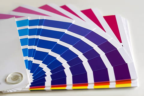
Are you looking to create a harmonious and visually appealing space in your home? One way to achieve this is by using minimalist color palettes. Minimalist color palettes can transform any room into a serene and clean space, promoting a sense of tranquility and sophistication. Whether you’re redecorating your living room or designing a new office space, incorporating minimalist color palettes can have a profound impact on the overall aesthetic and mood of the room.
Minimalist Color Palettes in 2024
In this article “Minimalist Color Palettes in 2024 : Harmonizing Your Space”, we will explore the various benefits of using minimalist color palettes, different design styles that can be enhanced by these palettes, and techniques for creating a balanced and visually pleasing color scheme. We will also discuss the use of accent colors and neutral tones to add depth and dimension to minimalist spaces. By the end of this article, you’ll have the knowledge and inspiration you need to create a harmonious and minimally designed space that reflects your personal style.
So, let’s dive in and discover the world of minimalist color palettes!
Benefits of Minimalist Color Palettes
When it comes to website design, less is often more. One popular design trend that has gained traction in recent years is the use of minimalist color palettes. By incorporating a limited range of colors, these palettes can create a clean and elegant look that is visually appealing and user-friendly. Let’s explore some of the benefits of using minimalist color palettes in website design.
Clean and Elegant Look
Minimalist color palettes simplify website design by focusing on a limited number of colors. This approach creates a sense of cleanliness and order, making the design feel more elegant and sophisticated. The absence of unnecessary visual clutter allows the content and key elements of the website to shine, resulting in a more visually impactful design.
Inspiration from Nature
Nature has always been a great source of inspiration for artists and designers, and minimalist color palettes are no exception. Many minimalist color schemes draw inspiration from nature, incorporating earthy tones, greens, browns, and blues. These natural colors evoke a sense of tranquility and balance, creating a harmonious visual experience for users.
Increasing Popularity of Neutral Color Palettes
Neutral color palettes have been increasingly popular in website design, and for good reason. These palettes consist of muted and understated colors, such as whites, grays, and beiges. The use of neutral colors allows for greater versatility, as they can easily complement and enhance other design elements. Neutral color palettes also lend a sense of sophistication and timelessness to a website, making them a popular choice for many brands and businesses.
Modern and Minimalist Look
In today’s digital age, minimalism has become synonymous with modernity. Minimalist color palettes, with their limited color choices and clean aesthetic, are often associated with modern and contemporary design. By embracing a minimalist approach, websites can convey a sense of style and innovation, appealing to a wide range of users.
Creating Calming Atmosphere
Certain color palettes have the ability to evoke specific moods and emotions. Pastel tones, for example, can create a calming and muted color palette, perfect for creating a serene and peaceful atmosphere. These soothing colors can help reduce visual stress and create an overall pleasant browsing experience for users.
In conclusion, minimalist color palettes offer numerous benefits for website design. They create a clean and elegant look, draw inspiration from nature, are increasingly popular for their neutral color choices, evoke a modern and minimalist vibe, and can create a calming atmosphere. Consider incorporating a minimalist color palette into your website design to achieve a visually appealing and user-friendly experience.
Minimalist Color Palettes in Different Design Styles
When it comes to designing a space with a minimalist aesthetic, choosing the right color palette is key. Minimalist design is all about simplicity, clean lines, and a calm and uncluttered atmosphere. By strategically selecting colors, you can create a harmonious and soothing environment that reflects your desired design style. In this article, we will explore how minimalist color palettes can be used in different design styles, starting with Japandi and Scandinavian.
Japandi
Japandi is a unique blend of Japanese and Scandinavian design that combines the functionality and simplicity of Scandinavian style with the elegance and craftsmanship of Japanese design. In Japandi interiors, you will often find a minimal color palette that creates a sense of serenity and balance. Some popular colors used in Japandi design include:
- Neutral Tones: Earthy shades like beige, taupe, and soft gray are commonly used to create a calming and natural atmosphere. These neutral tones serve as a backdrop for other design elements and allow them to shine.
- Soft Pastels: Soft pastel shades, such as blush pink, pale blue, and mint green, can bring a touch of tranquility and femininity to a Japandi space. These delicate hues add a subtle pop of color without overpowering the overall minimalist aesthetic.
- Natural Wood Tones: In Japandi design, the use of natural materials is crucial. Incorporating natural wood tones, such as light oak or walnut, adds warmth and texture to a space. These earthy tones help to ground the design and create a connection to nature.
Scandinavian
Scandinavian design is renowned for its clean lines, functional furniture, and light and bright interiors. When it comes to color palettes, Scandinavian interiors often embrace simplicity and create a sense of spaciousness. Some commonly used colors in Scandinavian design include:
- White: White is the star color in Scandinavian design. It reflects light, making a space feel brighter and more open. The use of white as the main backdrop allows other design elements, such as furniture and accessories, to stand out and create visual interest.
- Soft Grays: In addition to white, soft shades of gray are commonly used in Scandinavian interiors. These muted tones create a sense of calmness and neutrality, allowing other accent colors to take center stage.
- Cool Blues: Adding pops of cool blues, such as baby blue or icy blue, can bring a fresh and calming vibe to a Scandinavian space. These shades are reminiscent of the Scandinavian landscape and complement the overall minimalist aesthetic.
In conclusion, minimalist design styles like Japandi and Scandinavian rely on carefully chosen color palettes to create an atmosphere of serenity and simplicity. Whether you opt for neutral earthy tones or embrace the crispness of white and soft grays, these minimalist color palettes can transform any space into a haven of tranquility. Experiment with different hues and find the perfect balance that resonates with your personal style.
Using Monochromatic Color Palettes
Are you looking to create a sleek and stylish look for your space? Consider using monochromatic color palettes. This design technique involves using different shades and tones of a single color to create a cohesive and visually pleasing aesthetic. Not only does it offer a minimalist look, but it can also create the illusion of space, making smaller rooms appear larger. Let’s dive deeper into the benefits of using monochromatic color palettes in your design.
Creating a Minimalist Look
Monochromatic color palettes are often associated with minimalism, a design trend that emphasizes simplicity and clean lines. With a monochromatic color scheme, you can achieve a minimalist look by focusing on a single color and its variations. This creates a sense of harmony and unity throughout the room. Whether you choose a calming blue or a bold red, sticking to one color can create a sense of calm and order in your space.
When designing with a monochromatic color palette, keep the following tips in mind:
- Start with a base color: Choose a color that you love and that will serve as the foundation for your palette. This can be a neutral tone or a more vibrant hue.
- Use different shades: Once you’ve selected your base color, select lighter and darker shades of the same color to add depth and dimension to your design.
- Integrate texture: To avoid a flat look, incorporate different textures and materials into your space. This will add visual interest and create a layered effect.
Creating the Illusion of Space
One of the major advantages of using a monochromatic color palette is its ability to make a smaller room appear larger. By sticking to one color, you eliminate visual distractions that can make a room feel cramped. The consistent use of a single color creates a sense of continuity and flow, giving the impression of a larger space.
To effectively create the illusion of space with a monochromatic color palette, consider the following:
- Use light and neutral colors: Lighter shades tend to reflect more light, making a room feel brighter and more spacious. Opt for whites, creams, or pastels to achieve this effect.
- Layer with different textures: To prevent a monotonous look, incorporate different textures throughout the room. This adds depth and visual interest while maintaining the unity of the color palette.
- Choose furniture and accessories wisely: Select furniture pieces and accessories in complementary tones to enhance the overall effect. This will help create a cohesive and open atmosphere.
Incorporating a monochromatic color palette into your design can transform your space into a visually pleasing and harmonious environment. From creating a minimalist look to providing the illusion of space, the benefits of using monochromatic color schemes are undeniable. So, why not give it a try and see the magic a single color can bring to your home or office?
Enhancing Minimalist Design with Muted Accent Colors
In the world of interior design, minimalist aesthetics have gained massive popularity over the years. Clean lines, simple forms, and a clutter-free environment create an atmosphere of tranquility and sophistication. While a minimalist design focuses on simplicity, incorporating a muted accent color can add depth and visual interest to your space. These subtle hues can infuse personality into a minimalist design without overpowering its clean and peaceful vibe.
Blush Pink
One of the most popular muted accent colors in minimalist design is blush pink. This delicate and soothing shade adds a touch of warmth and femininity to a space while maintaining its understated elegance. Blush pink can be used as an accent color in various ways:
- Furniture: Incorporate a blush pink armchair or sofa as a focal point in the room. Its gentle hue will create a sense of comfort and coziness.
- Accessories: Add blush pink throw pillows, blankets, or curtains to complement the neutral tones in a minimalistic space. These small touches will bring a subtle pop of color without overwhelming the overall design.
- Wall Art: Hang artwork featuring blush pink tones on your walls. Opt for minimalist prints or abstract paintings to maintain the simplicity of the design while introducing a hint of color.
Green
Another versatile muted accent color for minimalist design is green. This natural and calming hue can bring a sense of tranquility and harmony to any space. Consider the following ways to incorporate green as an accent color:
- Indoor Plants: Bring the outdoors inside by placing various green plants throughout your minimalist space. Not only will they add a touch of color, but they will also improve air quality and create a peaceful atmosphere.
- Accent Wall: Paint one wall in a muted green shade to create a focal point in the room. This subtle pop of color will enhance the overall aesthetics without overpowering the minimalist design.
- Textiles: Introduce green textiles, such as curtains, rugs, or cushions, to add texture and visual interest while maintaining the simplicity of the space.
Blue
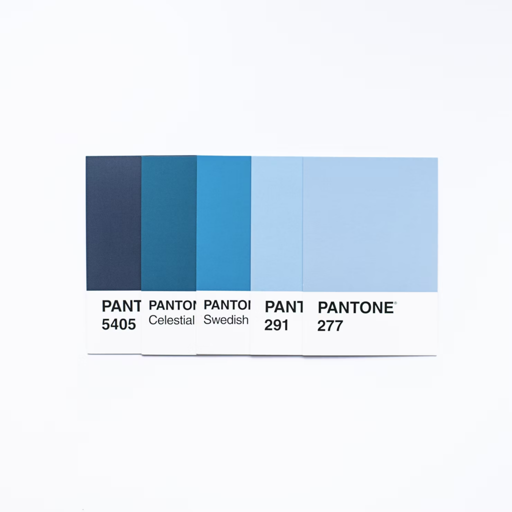
If you’re looking for a cool and serene accent color, consider incorporating shades of blue into your minimalist design. Blue can evoke a sense of tranquility and relaxation, perfect for creating a peaceful atmosphere. Here are a few ways to introduce blue as an accent color:
- Statement Furniture: Choose a minimalist blue chair or sofa to make a bold statement in the room. The simplicity of the design combined with the calming blue color will create a harmonious balance.
- Ceramics and Decorative Pieces: Place blue ceramics or decorative pieces on shelves or surfaces to add a touch of color and interest. Opt for minimalist designs to maintain the clean aesthetic.
- Wall Paint: Paint an accent wall in a muted blue shade to create depth and contrast in the space. This subtle addition of color will enhance the minimalist design without overpowering it.
Remember, when incorporating muted accent colors into your minimalist design, moderation is key. Stick to a limited color palette and opt for soft, muted shades that complement the neutral tones of a minimalist space. By doing so, you can strike the perfect balance between simplicity and visual interest, elevating your minimalist design to a whole new level.
Also Read: Minimalist Color Palettes : Creating Harmony and Balance in 2023.
Creating Vibrant Balance with Split Complementary Color Schemes
When it comes to creating visually captivating designs, color plays a crucial role. The right combination of colors can evoke specific emotions and grab the viewer’s attention. One way to achieve a vibrant balance in your designs is by using split complementary color schemes. In this article, we will explore what split complementary color schemes are, how they work, and how to effectively use them in your designs.
Understanding Split Complementary Color Schemes
A split complementary color scheme consists of a base color and two adjacent colors to its complementary color. This scheme offers a harmonious yet visually striking effect. By using two colors that are similar to the complementary color, but not exactly the same, you can create a visually balanced composition with a pop of vibrancy.
Take, for example, the primary color blue. Its complementary color is orange. In a split complementary color scheme, you would pair blue with two colors adjacent to orange on the color wheel, such as yellow-orange and red-orange. This combination creates a visually pleasing contrast while maintaining a sense of harmony.
The Benefits of Split Complementary Color Schemes
Using split complementary color schemes in your designs can offer several benefits:
- Vibrancy and Contrast: Split complementary color schemes allow you to create eye-catching designs with a balance of vibrant colors. The contrasting colors create visual interest, making your design stand out.
- Harmony and Balance: Unlike complementary color schemes, which can sometimes feel overwhelming, split complementary color schemes offer a more harmonious and balanced look. The colors are related, but not too similar, creating a sense of cohesion.
- Flexibility: Split complementary color schemes provide flexibility in design choices. You can experiment with various combinations and adjust the intensity of each color according to your preference.
Utilizing Split Complementary Color Schemes in Design
To effectively use split complementary color schemes in your designs, consider the following tips:
- Choose a Dominant Color: Start with a dominant color as your base. This color will be the main focus of your design.
- Select Adjacent Colors: Identify two adjacent colors to the complementary color of the base color. These colors will add depth and vibrancy to your design.
- Balance the Intensity: Adjust the intensity and saturation of each color to achieve the desired visual balance. You can use lighter or darker shades of the colors to create contrast and hierarchy.
- Use as Accents: Incorporate the adjacent colors as accents in your design elements such as typography, buttons, or illustrations. This will help create visual interest and draw attention to specific elements.
- Consider Color Psychology: Keep in mind the emotions and associations that each color evokes. Choose colors that align with the message or mood you want to convey in your design.
By following these guidelines, you can effectively create vibrant and visually balanced designs using split complementary color schemes.
In conclusion, split complementary color schemes offer a unique and visually appealing way to create balance and vibrancy in your designs. The combination of a base color with two adjacent colors to its complementary color creates a harmonious yet striking effect. By understanding the benefits and implementing these color schemes in your designs, you can create captivating visuals that stand out and leave a lasting impression on your audience.
Adding Richness and Grounding with Neutral Tones
When it comes to designing a space, choosing the right color scheme can make all the difference. While vibrant colors can bring energy and excitement, there is also something to be said for the understated elegance of neutral tones. By incorporating neutral colors into your design, you can add a sense of richness and grounding to any space. Let’s explore how neutral tones can achieve this effect.
Using neutral tones can add richness and grounding to a color scheme in several ways:
- Versatility: Neutral tones, such as shades of beige, gray, and taupe, are incredibly versatile and can complement a wide range of other colors. Whether you want to create a warm and cozy atmosphere or a sleek and modern look, neutral tones can adapt and enhance any design concept.
- Timelessness: Unlike trends that come and go, neutral colors have a timeless appeal. They can stand the test of time and remain stylish, making them a wise choice for long-term interior design. By incorporating neutral tones into your color scheme, you create a foundation that will never go out of style.
- Enhanced Texture: Neutral tones have a unique way of highlighting textures in a space. By using neutral colors on walls, floors, or furniture, you allow other design elements, such as wood grains, metallic finishes, or textile patterns, to take center stage. This creates a visually interesting and well-balanced atmosphere.
- Calming Effect: Neutral colors have a soothing and calming effect on the mind and body. They can create a sense of tranquility and relaxation, making them an excellent choice for bedrooms, living rooms, or any space where you want to promote a sense of serenity.
- Visual Cohesion: Neutral tones can help bring a sense of visual cohesion to a color scheme. When paired with bolder or brighter colors, neutrals act as a unifying element, providing a sense of balance and harmony. They can tie together different elements of a room and create a cohesive and cohesive design.
By incorporating neutral tones into your color scheme, you can add richness and grounding to your space. Whether you choose to use neutral colors as the main color or as accents, they have the power to transform a room and create a timeless and sophisticated atmosphere. So go ahead and explore the world of neutral tones and discover the endless possibilities they offer for your design project.
Understanding Color Harmonies and Techniques
Color is a powerful tool that can greatly impact the visual appeal and overall mood of a design. Choosing the right combination of colors is crucial for creating visually pleasing and harmonious compositions. In this article, we will explore different color harmonies and techniques that can help you achieve stunning results in your designs.
Complementary Schemes
One popular color scheme is the complementary scheme, which involves using colors that are opposite each other on the color wheel. This creates a high contrast and vibrant effect that can be visually striking. Some examples of complementary color pairs are:
- Red and Green: This combination creates a strong visual impact and is often associated with the holiday season. However, it can also be used creatively in other contexts to make elements stand out.
- Blue and Orange: This complementary pair creates a sense of balance and harmony when used together. It is a popular choice in sports team branding and advertisements.
- Yellow and Purple: The combination of these two colors creates a bold and energetic look. It can be used to create a vibrant and eye-catching design.
Triadic Schemes
Another technique for selecting color combinations is the triadic scheme. This scheme involves using three colors that are evenly spaced around the color wheel, forming a triangle. The triadic color scheme offers a balance between contrast and harmony. Examples of triadic color combinations include:
- Yellow, Blue, and Red: This combination creates a playful and dynamic effect. It is commonly used in children’s designs and illustrations to create a fun and energetic atmosphere.
- Green, Orange, and Purple: This triadic scheme offers a more sophisticated and balanced look. It can be used to create a visually interesting design with a mix of warm and cool tones.
- Red, Yellow, and Blue: The primary colors form a classic triadic combination that is commonly seen in many art and design contexts. This scheme offers a diverse range of possibilities for creating visually appealing compositions.
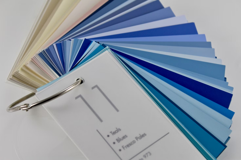
Monochromatic Schemes
A monochromatic color scheme involves using different shades, tints, and tones of a single color. This creates a harmonious and elegant look with a sense of unity. Examples of monochromatic color combinations include:
- Various shades of blue: This creates a calming and soothing effect and is often used in designs related to water or nature.
- Different tones of gray: This monochromatic scheme offers a sophisticated and timeless look. It is commonly used in minimalist designs and modern interiors.
- Various tints of pink: This color scheme creates a feminine and romantic atmosphere. It is often used in designs related to beauty, fashion, and weddings.
Understanding color harmonies and techniques is essential for creating visually appealing designs. Whether you choose a complementary, triadic, or monochromatic scheme, experimenting with different color combinations can elevate your designs to the next level. So go ahead, unleash your creativity, and make your designs stand out with the power of color harmonies.
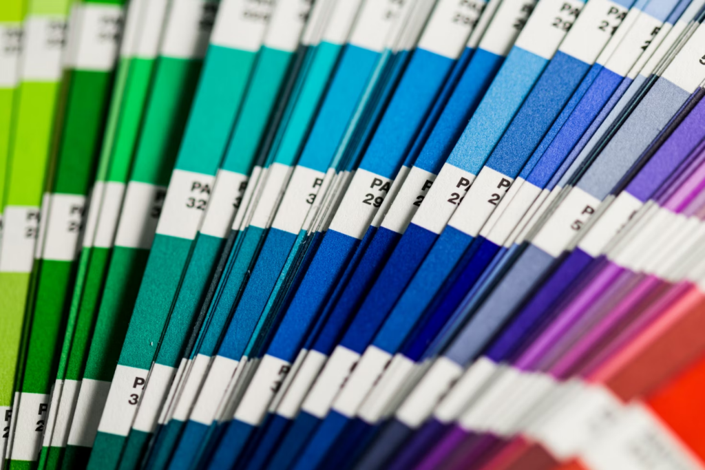
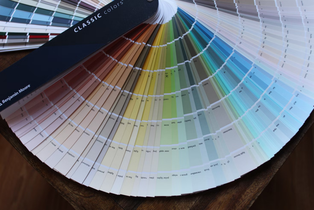
Generating Color Palettes
Creating a visually appealing color palette is essential when designing websites, logos, or any visual content. A well-chosen color scheme can enhance user experience, evoke emotions, and convey the right message to your audience. In this section, we will explore two popular methods for generating color palettes: using online tools and leveraging color palette generators.
Online Tools
Online tools have made the process of generating color palettes easier than ever before. These platforms offer a wide range of features and options to help you create the perfect color combination for your project. Here are a few advantages of using online tools for color palette generation:
- Ease of use: Online tools are often user-friendly and intuitive, making it easy for both beginners and experienced designers to navigate and create beautiful color schemes.
- Vast color libraries: Many online tools provide access to extensive color libraries, allowing you to explore various shades, hues, and tones to find the perfect colors for your palette.
- Real-time previews: With online tools, you can see your color palette in action through real-time previews. This feature allows you to visualize how your colors will look together before implementing them in your design.
- Customization options: Online tools often offer customization options, such as the ability to adjust color saturation, brightness, and contrast. This level of control allows you to fine-tune your color palette to align perfectly with your project’s aesthetics.
Color Palette Generators
Color palette generators are specialized software or algorithms that generate harmonious color combinations based on specific rules or principles. These generators take the guesswork out of color selection and provide scientifically-vetted combinations that are visually pleasing and balanced. Here are a few advantages of using color palette generators:
- Consistency: Color palette generators ensure consistency in your designs by providing harmonious color combinations that work well together. This consistency helps create a cohesive and professional-looking visual identity.
- Save time: Color palette generators save you time by automating the process of color selection. Instead of manually experimenting with different color combinations, you can quickly generate a well-matched palette with just a few clicks.
- Guided design choices: Color palette generators often offer design principles and rules to help you make informed choices. These principles, such as complementary colors or analogous colors, offer a solid foundation for creating visually appealing designs.
- Accessibility considerations: Some color palette generators cater to accessibility needs, ensuring that the chosen color combinations provide sufficient contrast for individuals with visual impairments.
Remember, when using these tools and generators, it’s important to consider your target audience, the message you want to convey, and the overall aesthetics of your project. Experiment, play around with different color combinations, and trust your artistic intuition to create a color palette that truly stands out. Happy color palette exploration!
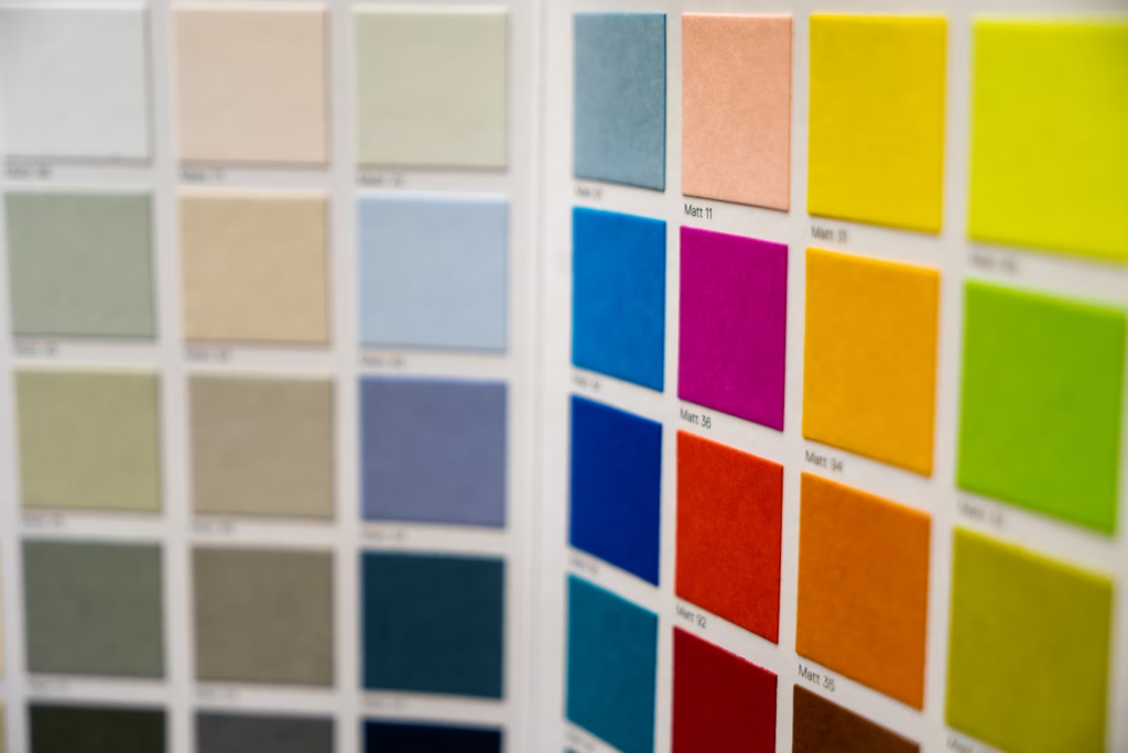
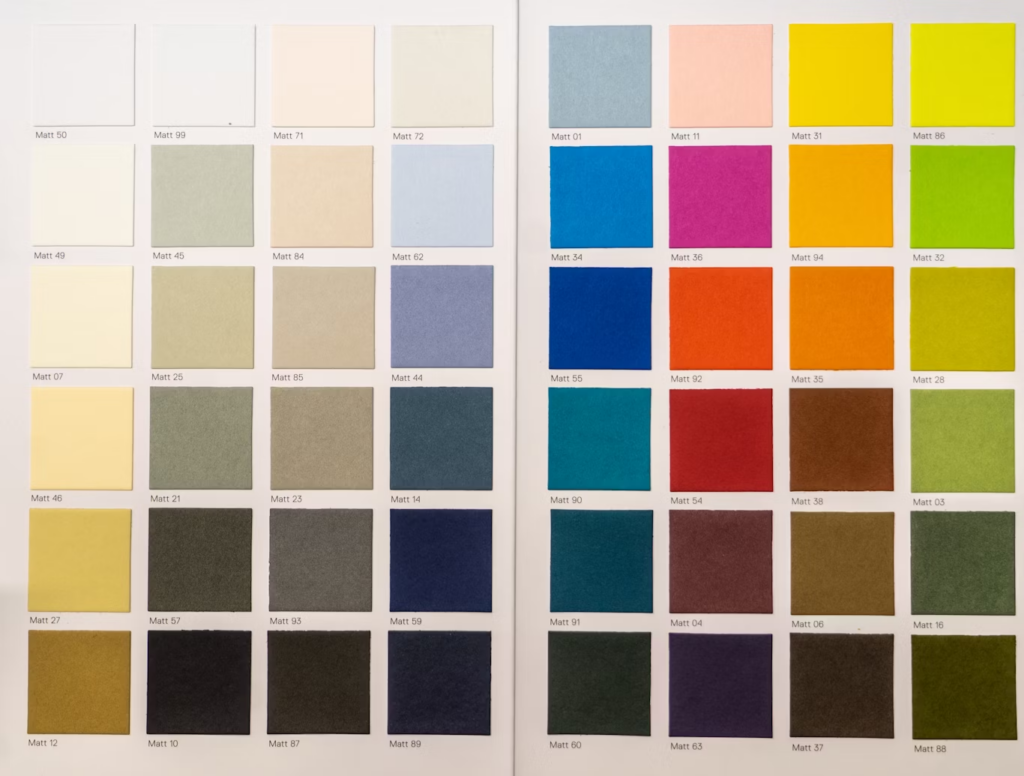
Harmonizing Colors with Neutral Tones

As we delve into the world of interior design, one concept that often comes up is the use of neutral tones. These versatile shades, such as white, beige, gray, and taupe, can create a calm and soothing ambiance in any space. But what about adding a pop of color to these neutral palettes? Can they be harmonized effectively to create a visually stunning and cohesive room? The answer is a resounding yes! In this article, we will explore how to harmonize colors with neutral tones to achieve a harmonious and beautiful space.
The Power of Neutral Tones
Neutral tones serve as a foundation for any design palette. Their versatility makes them compatible with various colors, patterns, and textures. By incorporating neutral tones into your space, you can achieve a timeless and elegant look that will stand the test of time. Moreover, neutrals create a blank canvas that allows other elements in the room to shine, whether it be furniture, artwork, or accessories.
Introducing Color
To prevent a space from feeling dull or monotonous, integrating colors with neutral tones is essential. Colors can add depth, personality, and visual interest to a room, creating a sense of warmth and liveliness. When done right, the combination of colors and neutrals can result in a harmonious balance that is both visually appealing and comforting.
Understanding Color Harmony
Before diving into the specifics of combining colors with neutral tones, it’s essential to understand the concept of color harmony. Color harmony refers to the arrangement of colors in a way that is pleasing to the eye. There are several ways to achieve color harmony, including complementary colors, analogous colors, and monochromatic colors. Let’s take a closer look at each of these approaches:
Complementary Colors
Complementary colors are those that are directly opposite each other on the color wheel. For example, blue and orange or red and green. When paired together, complementary colors create a vibrant and eye-catching contrast. To harmonize complementary colors with neutral tones, consider using one color as the dominant hue and the other as an accent. This will ensure that the neutral tones act as a grounding element, balancing out the vibrant colors.
Analogous Colors
Analogous colors are adjacent to each other on the color wheel and share similar hues. For instance, yellow, orange, and red or blue, purple, and pink. Analogous color schemes create a sense of cohesion and flow in a space. To harmonize analogous colors with neutral tones, select a dominant neutral shade and incorporate pops of analogous colors strategically. This will maintain the unity of the overall design while adding visual interest.
Monochromatic Colors
Monochromatic color schemes involve using different shades, tints, and tones of a single color. This approach creates a visually soothing and harmonious effect. To harmonize monochromatic colors with neutral tones, select a neutral shade as the base color and introduce varying lighter and darker shades of that color throughout the space. This will create a cohesive and serene atmosphere.
Pulling It All Together
Harmonizing colors with neutral tones is all about finding the right balance. Here are some tips to keep in mind when incorporating colors into a neutral palette:
- Start with a neutral foundation: Begin by selecting a neutral tone as the base color for your space. This will serve as a backdrop for the accent colors and provide a sense of cohesion.
- Choose a color palette: Determine the colors you want to incorporate and decide on the color harmony approach that suits your style. Complementary, analogous, and monochromatic schemes each offer a unique aesthetic.
- Use the 60-30-10 rule: When using multiple colors, follow the 60-30-10 rule. Allocate 60% of the space to the dominant color, 30% to the secondary color, and 10% to the accent color. This will ensure a visually pleasing balance.
- Experiment with textures and patterns: Incorporate different textures and patterns to add depth and visual interest. This can be achieved through textiles, wallpapers, rugs, or even textured paint finishes.
By taking these considerations into account, you can confidently harmonize colors with neutral tones to create a visually stunning and cohesive space. So don’t be afraid to add a splash of color to your neutral palette and let your personality shine through. After all, design is an expression of who you are.
Also Read: Minimalist Color Palettes: Creating Harmony and Balance in Your Space.
Conclusion
In conclusion, incorporating minimalist color palettes into your home design can have numerous benefits. From creating a clean and elegant look to inspiring from nature and achieving a modern and minimalist aesthetic, these color schemes are gaining popularity for their ability to create a calming and clutter-free atmosphere.
By using monochromatic color palettes, you can further enhance the minimalist look of your space and even create the illusion of a larger area. Additionally, muted accent colors like blush pink, green, and blue can add depth and interest without overpowering the overall design.
For those looking to add a vibrant balance, split complementary color schemes offer an exciting option. On the other hand, neutral tones can bring richness and grounding to your minimalist design.
Understanding color harmonies and techniques, such as complementary schemes, triadic schemes, and monochromatic schemes, can guide you in creating harmonious color combinations.
To help you generate your own unique color palettes, online tools and color palette generators are available, making it easy to find the perfect combination for your minimalist space.
Consider harmonizing your chosen colors with neutral tones to achieve a cohesive and balanced look.
When it comes to creating a minimalist interior, the possibilities are endless. By leveraging the power of color, you can transform your space into a serene and stylish sanctuary that reflects your personal taste and aligns with the minimalist aesthetic.
Remember, the goal is not to limit yourself to strict rules, but rather to embrace simplicity and create a space that brings you joy and tranquility.
to get access to more content, read Color Ideas to Try : Transform Your Kitchen with a Fresh Coat of Paint in 2023. Happy Coloring!!
If you’re interested in exploring more minimalist home design ideas and guidance, visit Minimalist Home Guru for expert tips and inspiration. Start decluttering, selecting clean-lined furniture, and creating your ideal minimalist living space today.
Frequently Asked Questions
- What are minimalist color palettes?
Minimalist color palettes are combinations of a few simple and understated colors that create a clean and uncluttered look. These palettes often include neutral shades like whites, grays, and blacks, along with muted or pastel tones. - Why are minimalist color palettes popular?
Minimalist color palettes are popular because they create a sense of calm, simplicity, and elegance in a space. They are visually soothing and can make a room appear more spacious and uncluttered. - How do I choose a minimalist color palette for my space?
When choosing a minimalist color palette, consider the mood and atmosphere you want to create in your space. Opt for neutral base colors and add one or two accent colors for visual interest. Experiment with different shades and hues to find the perfect balance. - Can minimalist color palettes work in any room?
Yes, minimalist color palettes can work in any room. Whether it’s a living room, bedroom, kitchen, or office, the clean and understated nature of minimalist colors can enhance the overall aesthetic and create a harmonious environment. - How can I incorporate minimalist color palettes into my home decor?
To incorporate minimalist color palettes, start by painting your walls with a neutral shade. Then, choose furniture and decor items in complementary colors or tones. Keep the overall look clean and uncluttered, with minimal patterns and textures.